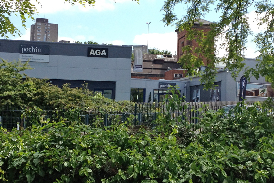
Pochin set us what they called ‘the impossible brief’, to create a new brand for the company that spanned both retail and trade, along with all of the different divisions of the company. At the time Pochin were nearing their 150th year celebration, and they wanted the new brand to position them as a forward thinking, modern company with an established, trusted reputation.
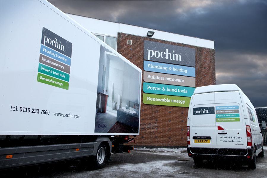
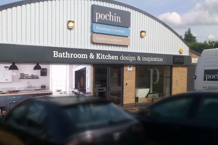
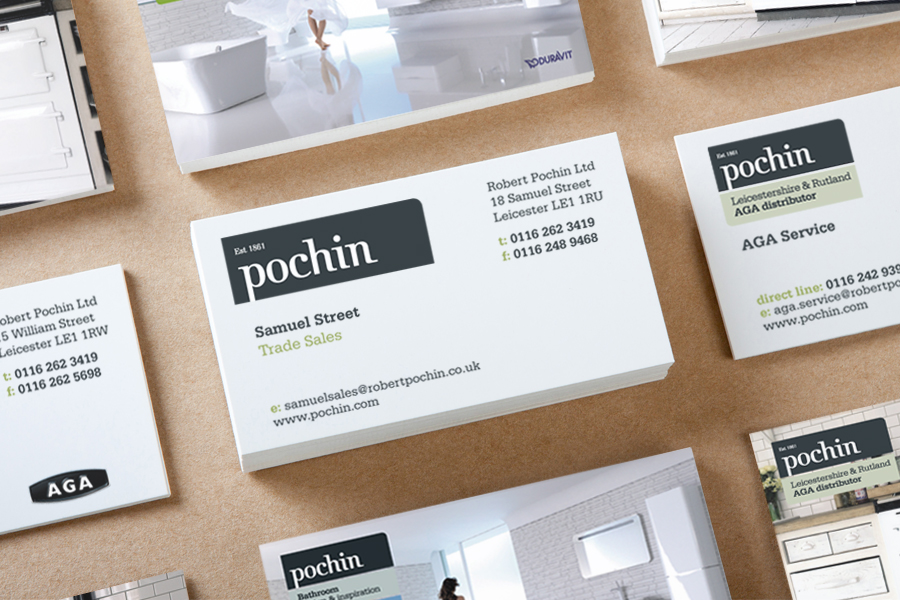
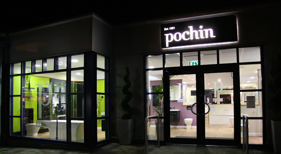
Our initial thought was that the company name, Pochin, needed to be able to stand alone without any reference to the company divisions. As the usage for the logo would be so diverse (van livery, showrooms, website, etc.) we decided to keep it contained to make it stand out. We used a sophisticated deep grey colour for company name, that we then contrasted with a more vibrant colour palette to define each division of the company.
A modern serif font was re-drawn for the logo to give it a more modern cut, with reference to a traditional typeface – hinting at the strong heritage of the company. The brand has been structured to be flexible across the many applications needed, allowing relevant divisions to be stacked underneath the logo as required.
We’ve created a really strong, modern feel for the Pochin brand. It looks fantastic in both retail and trade environments, and gives the flexibility needed for its diverse application. The new brand has been welcomed by both trade and retail customers, and has given the customers a clear signal… Pochin have already been around for 150 years, and they’re a forward thinking company that is here to stay.