Designing a new brand for ourselves was always going to be a challenging project, firstly because our client work always comes first, so finding the time to dedicate to the project was tricky, and secondly we are a very critical client.
Our thinking was to create a mark that, in time, would be recognisable as Newenglish without even seeing the word Newenglish. Our brand needed to reflect the different areas we specialise in (brand, digital, advertising, and interiors), be creative and recognisable and reflect how we flexibly respond to our client’s needs.
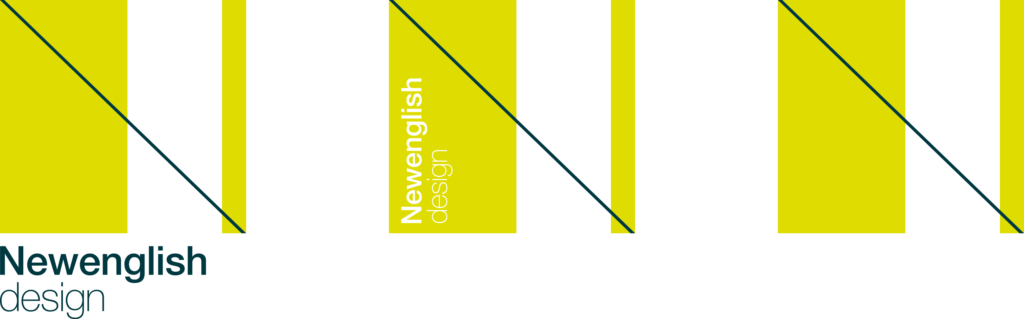
Our new brand elegantly consists of just three elements, two coloured rectangular forms that are linked with a fine line connecting the two forms, this creates an original shape that is easily read as a capital N. The N form can be abstracted by using different parts of it, creating a visually interesting statement.
We have created a suite of logos, including a version where the typography sits within the N form.
The font
As you can imagine a great deal of thought was given to the font, and after many experiments the classic proportions of Helvetica Neue was chosen as our favourite; elegant, simple with a strong presence. The wide array of font weights makes the font incredibly versatile.
The vibrant lime yellow adds a pop of colour and is combined with an almost black teal for the typography.
Animation
The two rectangular forms can be animated and as well as the typography descriptor, communicating the breadth of what we offer: design – brand – digital – interior.