When our very talented film maker friend, Andy Taylor Smith, decided to set up as a company with equally talented Owen Davies, we jumped at the chance to create a new identity for them.
They came to us with their new name, ‘We Are Caravan‘, a few logo examples they liked, and a pretty open brief for us to come up with a striking but simple logo to communicate their creative, edgy style.
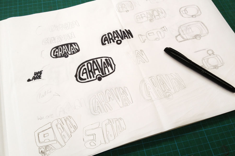
Using the recognisable caravan form as a starting point, we explored several typo-illustration routes using hand drawn lettering to combine the name with the image. The challenge was creating something that had the right balance of creatively, edginess, legibility and simplicity to create a logo that reads and communicates quickly. We kept to a striking black and white simplicity to focus on the form and maximise impact.
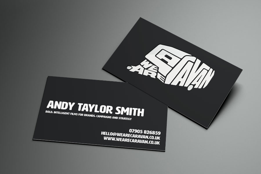
We think the deceptively simple logo hits the mark. The big and bold ‘Caravan’ lettering is read and seen simultaneously. The integrated ‘We Are’ reads slightly secondary, but correctly due to the location front left of the logo. This is a logo that will work hard across all sorts of media. From business cards to their website, or large scale vinyl graphics in the office, to end credits on a film reel.
To extend the bold brand look we selected the HWT Artz font, for solid and punchy headline text that perfectly complements the logo.
A suitably ‘cool’ brand for a very creative duo.
Thanks again for all your hard work on this project, you have really taken our brand to the next level with your beautiful design.