At Newenglish we relish the challenge of turning numbers, figures and interesting statistics into beautifully designed, informative reports. So much so, that we recently presented a Masterclass on the subject to one of the UK’s largest retailers (not to blow our own trumpet!).
So we’re very pleased to share this Environmental, Social and Governance (ESG) digital report that we recently created for A2Dominion…
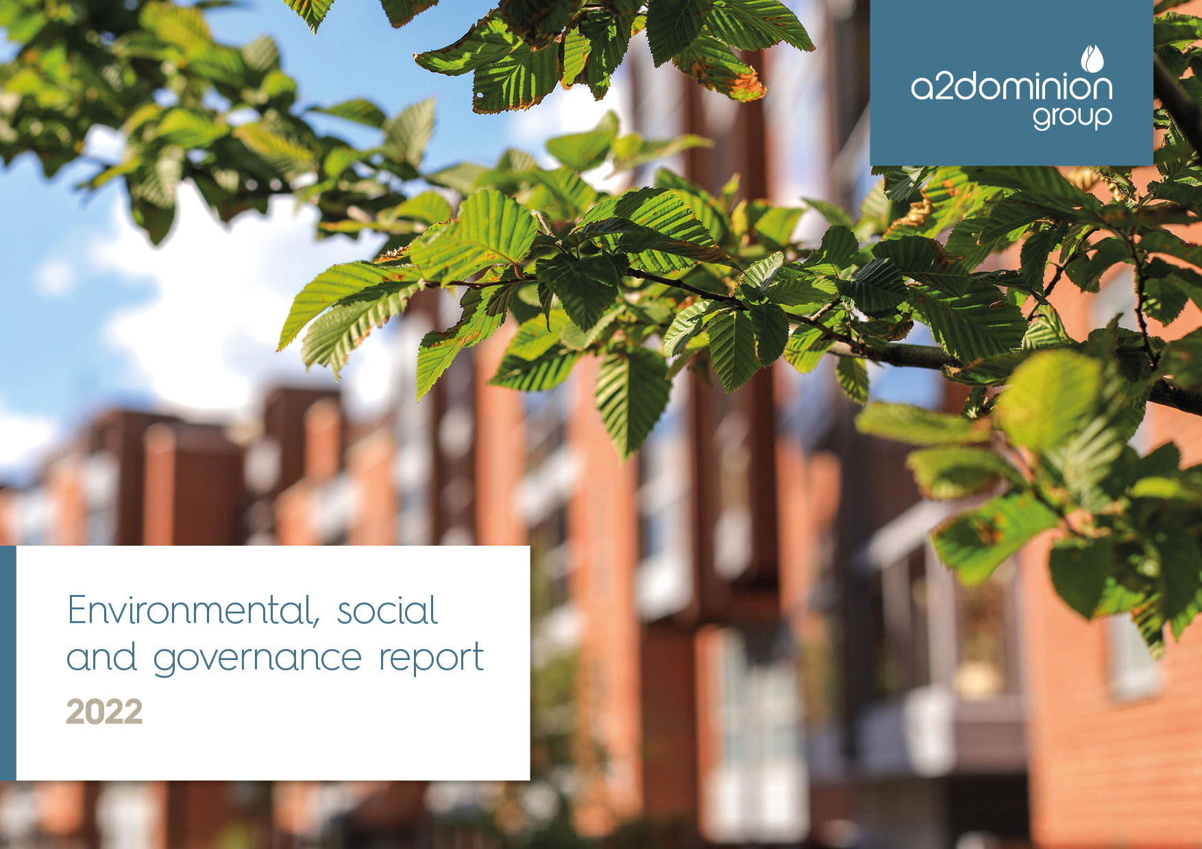
A2Dominion ESG Report 2022
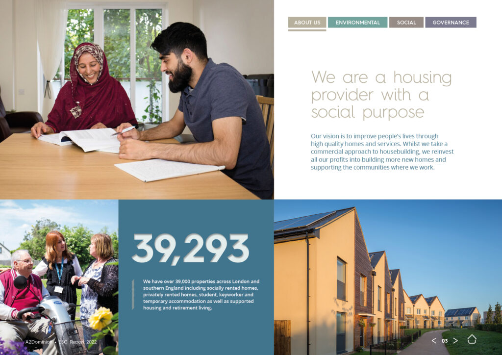
A2Dominion are a housing provider with a real social purpose. With over 39,000 properties located across London and the south of England, they strive to improve people’s lives through their high quality homes and personable service.
We were delighted when they asked us to create their 2022 ESG Report.
What is an ESG report?
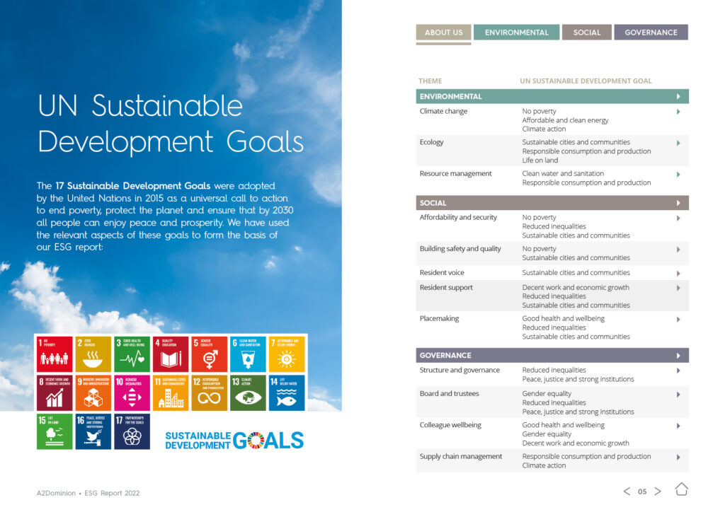
An ESG report is an important document which companies publish annually to evaluate and monitor the Environmental, Social and Governance impact of their organisation. These reports also chart the progress being made towards achieving their ‘Sustainable Development Goals’, a global initiative set up by the United Nations.
Our approach
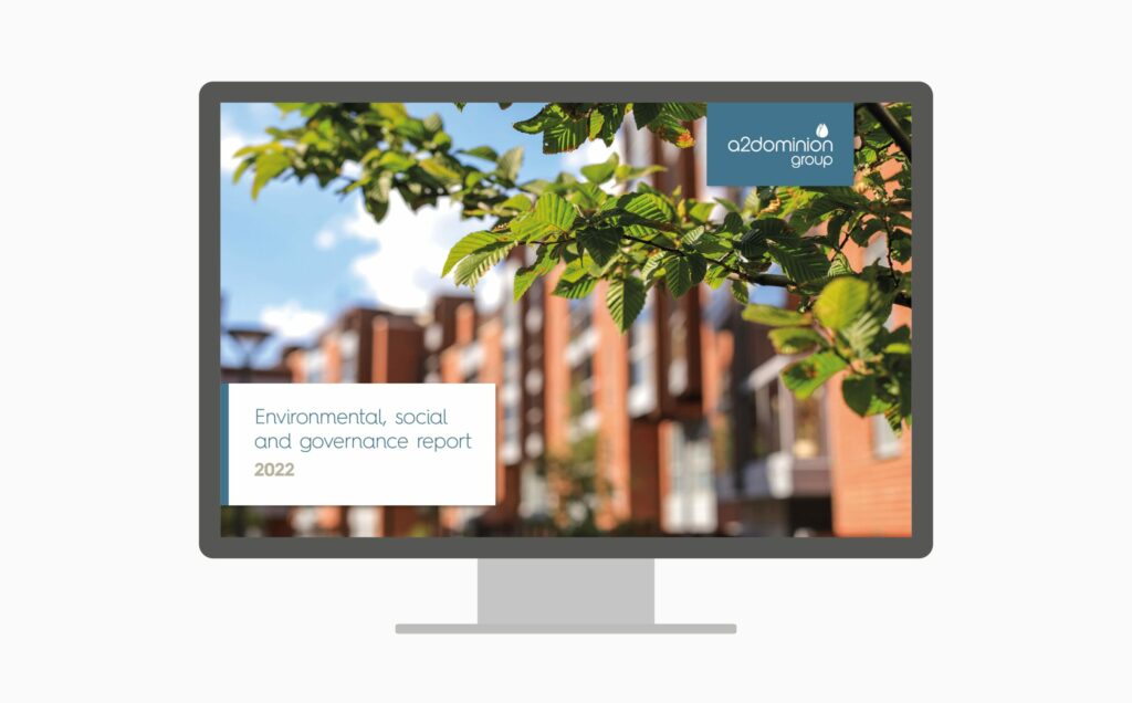
We created an engaging and interactive, digital report to be viewed online. Built with dynamic page layouts, clear messaging and a structured hierarchy of information – the design successfully breaks down the data and information into manageable bitesize chunks, to tell a clear story that’s easier for the reader to digest.
Clean, well-balanced layouts and a good use of white space, combine with carefully considered lifestyle-led imagery to deliver a real clarity of communication, whilst also reflecting A2Dominion’s brand personality.
It looks great, I love the design.
Senior Corporate Communications Manager
The 32 page document is split into four sections, with each one assigned its own key colour key colour to work as a visual aid and improve usability and navigation throughout the document.
The colours and tints are taken from A2Dominion’s brand colour palette. It was important they had enough contrast between them to create a clear visual difference between the sections of the report.

Providing a good user experience
We talk a lot about user experience (UX) when designing websites, but many of the same principles apply when designing a digital report. Good navigation is key – the reader needs to be able to find their way through the document effortlessly, with a UX mimicking that of a well designed website or app.
With that in mind we created a simple, colour-coded navigation bar which sits neatly in a fixed position on each page of the document. This navigation bar allows the user to ‘hop’ with ease between the four sections of the report with a simple click – making it easy for them to view the precise area of content that they want to see.
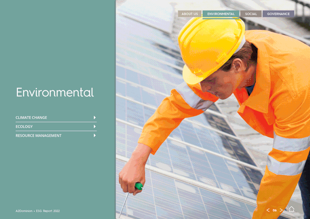
Each section then begins with a colour-coded title page, featuring a large, relevant lifestyle image alongside a mini-contents menu. This hyperlinked menu lists the subjects covered within that particular section of the report, and again, the user can travel to specific content they want to see with a click.
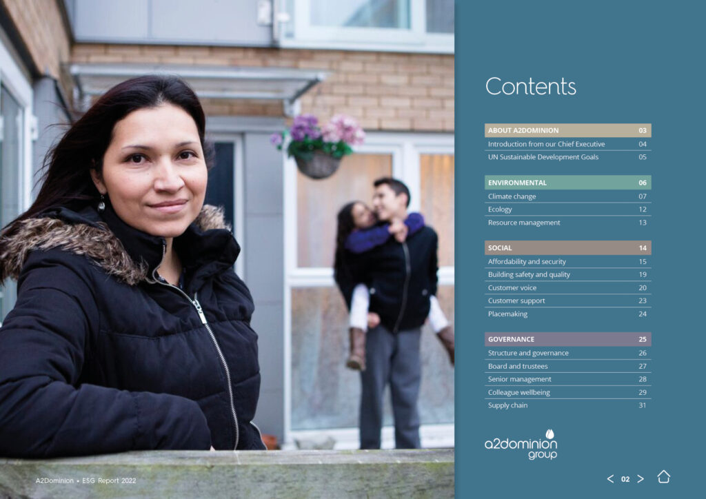
The main contents page is also fully hyperlinked, and works in a similar way to the navigation tab – but goes a step further by allowing the reader to travel to any individual page of their choosing within the report.
To further aid navigation, every page within the report features useful forward/back arrows allowing the reader to click to access the previous/next page, as well as that all important ‘home button’ – a key feature of interactive PDFs. One click on the home button takes the reader back to the main contents page, where, as mentioned above, they can then access any page within the report.
All of these hyperlinked elements combine to provide a seamless, ‘website-like’ user experience, ensuring that the reader remains in full control of the content they are viewing, and never feeling lost within the report.
It looks fabulous – absolutely love the cover!
Head of Corporate Strategy
Images that tell stories
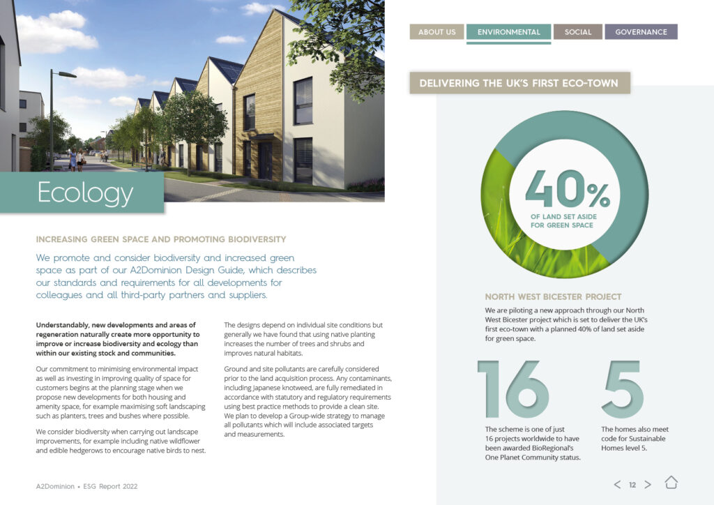
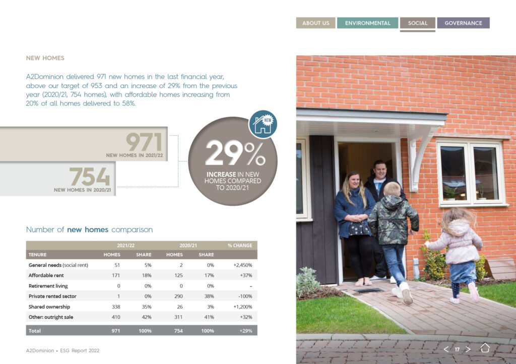
We wanted strong, lifestyle-led imagery to be a visual thread running throughout the report. To achieve this we worked closely with the team at A2Dominion to ensure we had the right shots of their tenants, staff and suppliers – communicating real stories from real people, and bringing a real sense of authenticity to the report.


Engaging infographics
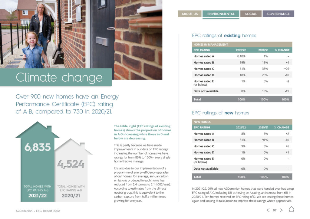
Presenting figures and financial information needn’t be dull and uninspiring – far from it!
Infographics are a great way to help tell a story, highlight a statistic, or push a particular line of messaging. We created a series of stylish and visually engaging infographics, graphs and figures, to help the reader to get a good overview of some of the key stats within the report, at a glance.
In fact, A2Dominion were so pleased with these infographics, they’ve been sharing them as eye-catching and informative content for their followers across their social media channels.
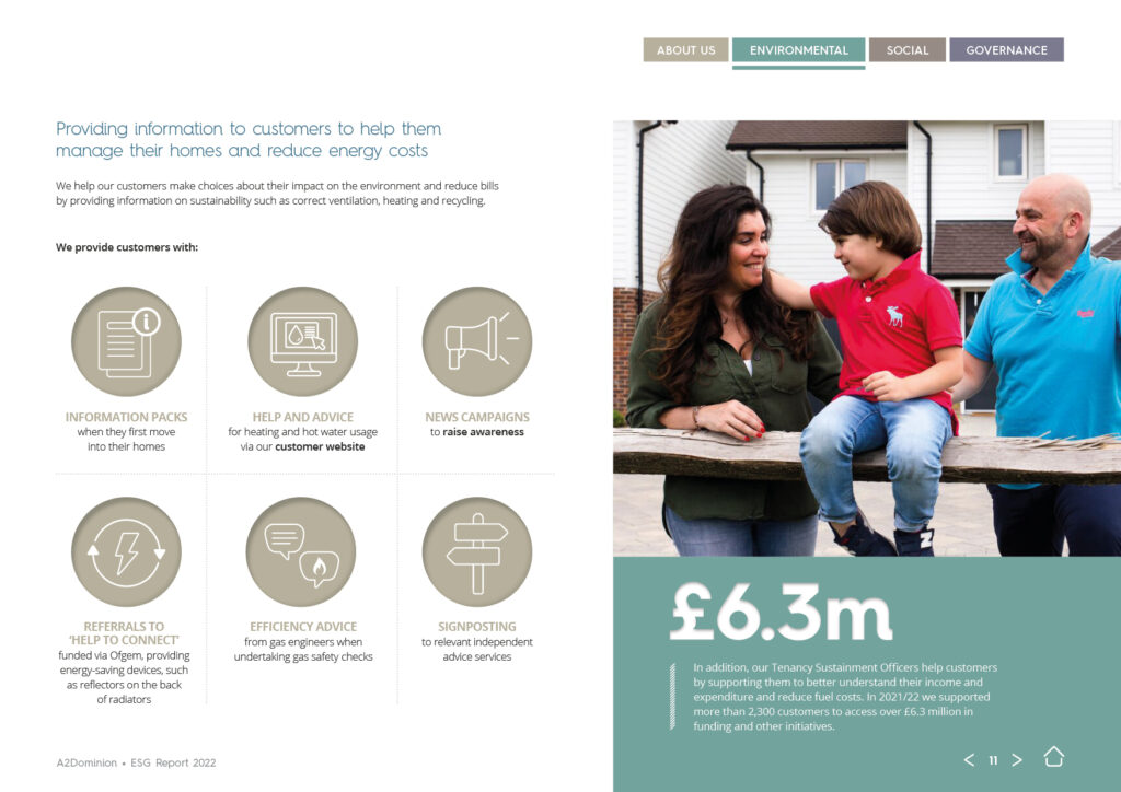
Illustrative icons
Working alongside the infographics, we also created a series of illustrative icons – their simple style not only adds character, and visual interest, but also helps to communicate a particular point at a glance, further helping the reader to absorb the report content.
This report also was designed with different user types in mind. Those who want to a ‘quick-flick’ through the document to take away the key points, and those who want to delve-in further and really get to the detail. This design caters for both.
We are very grateful that A2Dominion trusted us with the design of the ESG Report, and just like them, we’re delighted with the end-result and were really pleased to see it published and receive great feedback.
It is lovely, I’m very happy and look forward to publishing it! Thank you for all your hard work.
Senior Strategy Analyst
Want to see more? You can take a look at the full report by clicking here.