
Showcase to leave-behind
STEPHEN GEORGE + PARTNERS
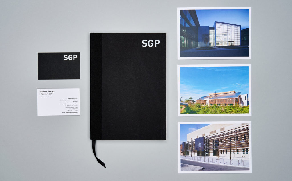
Stephen George + Partners (SGP), are an award-winning architectural practice. Established in 1970, they have grown to be one of the UK’s leading firms with offices in London, Leicester, Leeds, Birmingham, and Solihull. Their impressive portfolio spans a variety of projects.
- Brand
Refreshing change
SGP needed to refresh their brand, as it no longer represented who they were. So, we carried out an extensive body of work to create a simple but effective brand identity—one that is fitting for their award-winning credentials, one that feels aspirational, and one that positions them correctly within the sector.

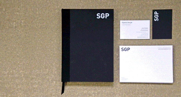

Alongside the brand refresh, we produced some promotional literature, which allows SGP to showcase their broad spectrum of projects.
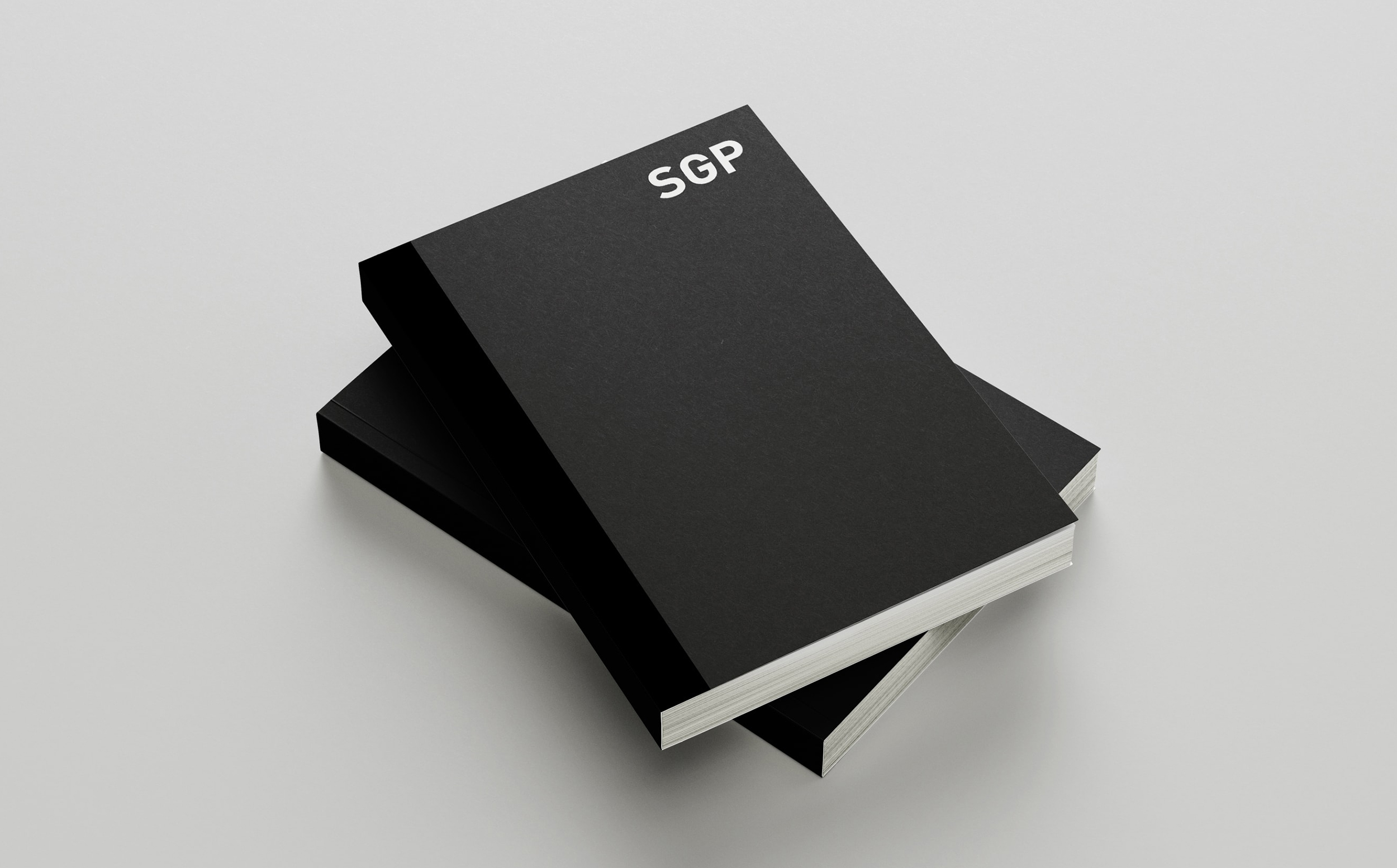
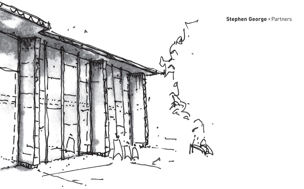
We wanted to create a piece which felt substantial but was easy to carry away. The case study book we designed and produced oozes with quality and precision, reflective of SGPs work. The materials and print finishes used make it feel special to pick-up and touch, and the clean layouts and stunning photography make it a joy to look through and read.

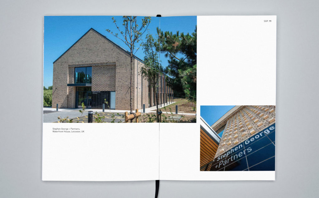


The photography is hero throughout and carefully designed minimal typography works beautifully alongside. We chose a paper stock which is smooth, matt, and gives a crisp finish with clarity to the photography.
The heavy board cover is printed with white foil block lettering, which has a pleasing indent when you brush your finger across it. The spine is wrapped with cloth tape and a fine ribbon place marker is integral to the binding of the book.
SGP loves their book and has received many positive comments from their clients and potential clients.
You may also be interested in...
Discover the Newenglish Perspective. Why not take a look at our blog?