Educating achievers since 1495
THE LOUGHBOROUGH SCHOOLS FOUNDATION
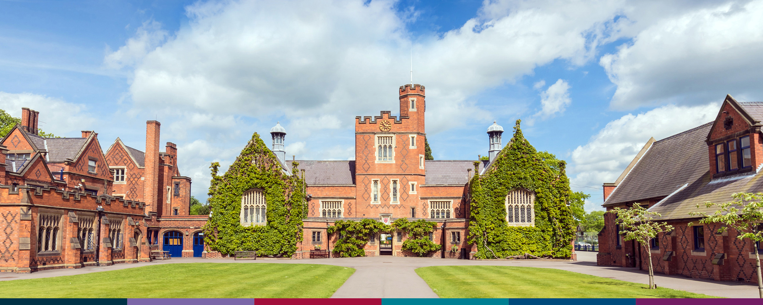
The Loughborough Schools Foundation is a close-knit family of top-performing, independent schools in Leicestershire. Steeped in history, the Foundation provides an education to cherish, equipping its pupils for a lifetime of achievement.
- Brand
- Exhibition
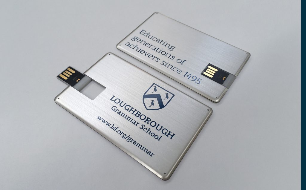
- Merchandise
- Photography


Unifying the brand
Working closely with the Foundation, we carried out an extensive brand alignment programme to unify the four schools, the nursery, and their renowned music school. Renamed and repositioned, we presented the family of schools as one consistent brand.

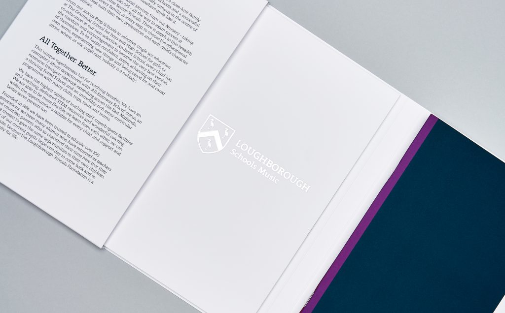
We simplified the historic school shield, giving it a modern edge that still retains the Foundation’s traditional look and values. The clean and simple lines of the new shield make it much more flexible to use across a variety of media, particularly online.

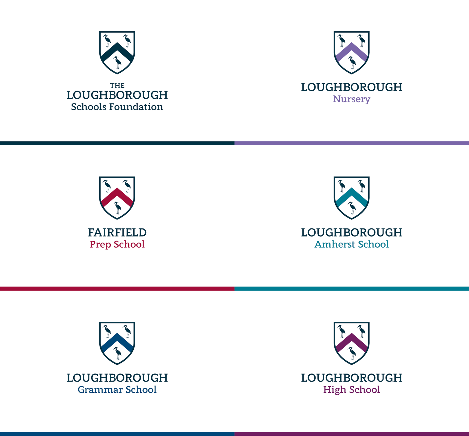
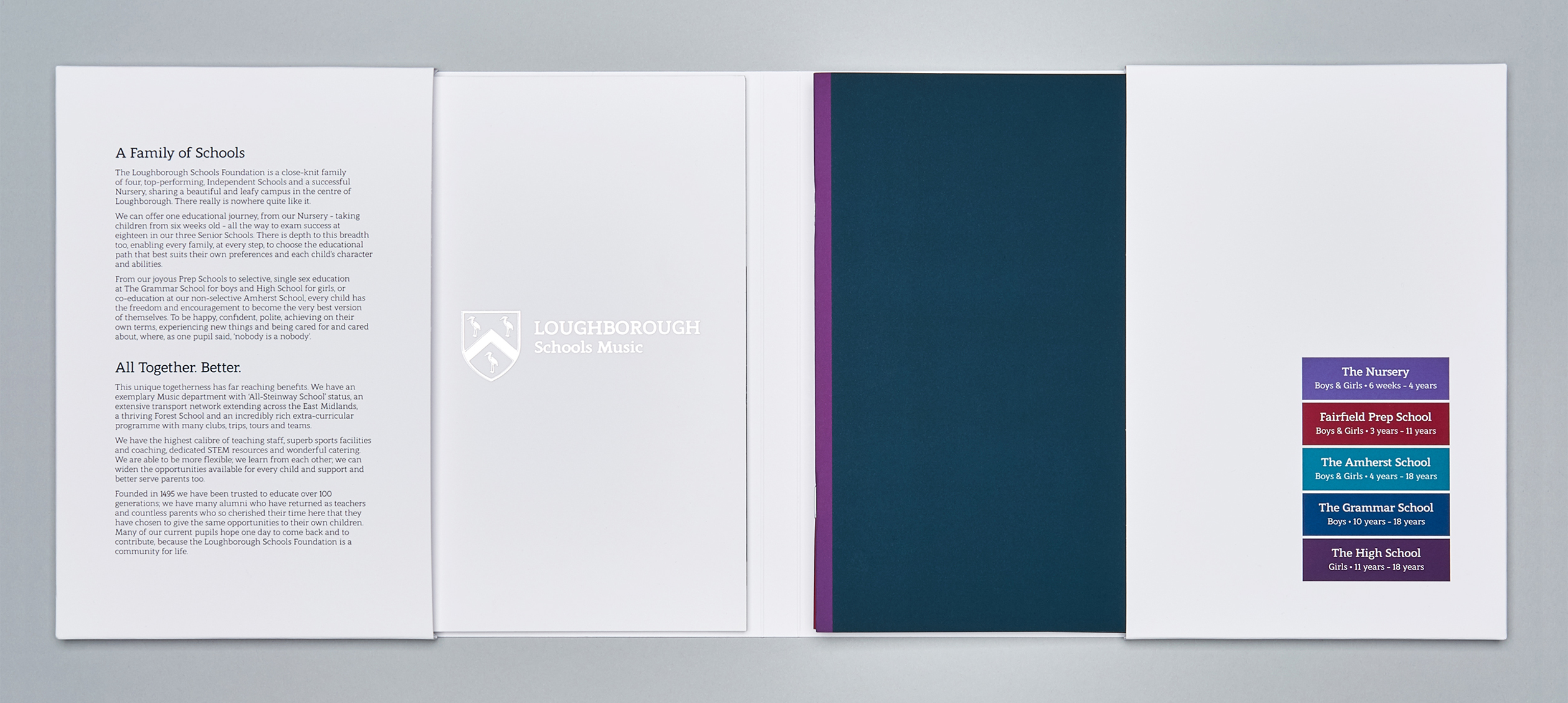
To distinguish between them, we gave each school in the Foundation a unique colour. Each colour was carefully created with the individual school in mind, to represent the different groups of pupils and ages. The supporting key colours complement the revised master palette and refresh the brand. Each school has its own unique character, strong enough to stand alone, whilst sitting neatly under the unified umbrella of the Foundation.
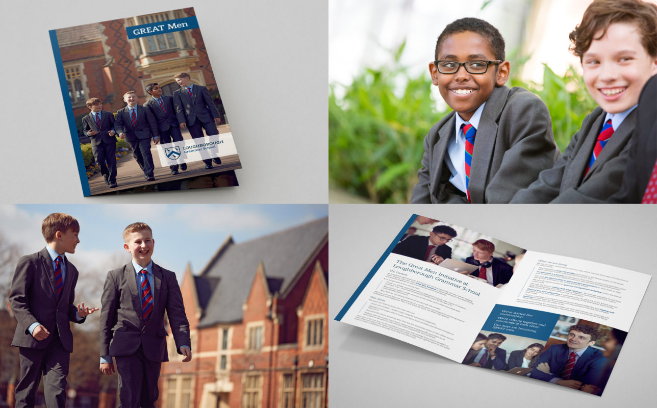
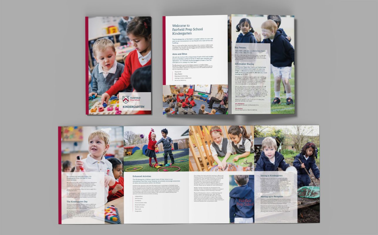
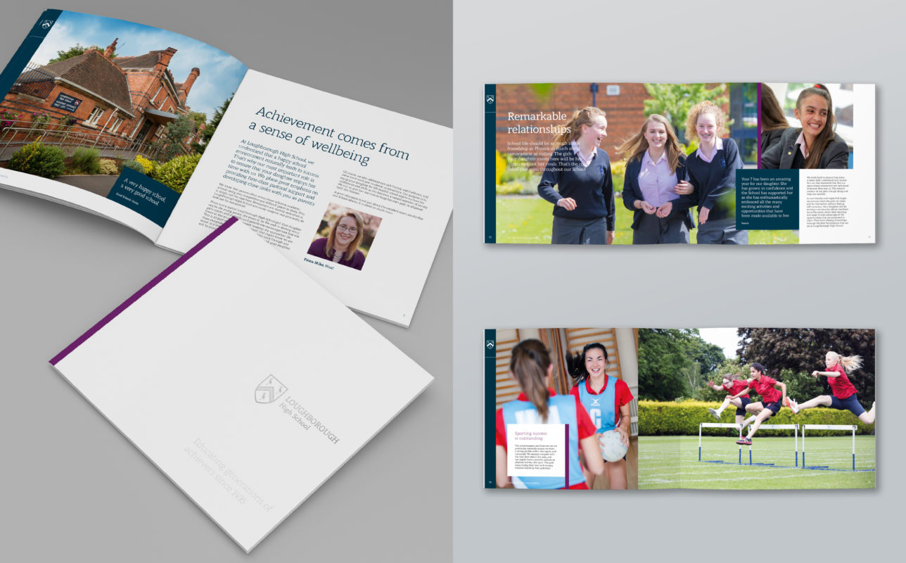
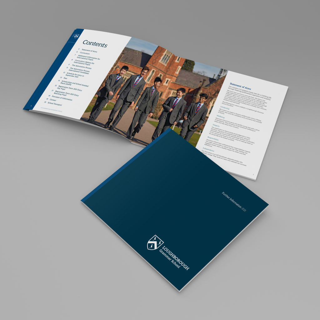
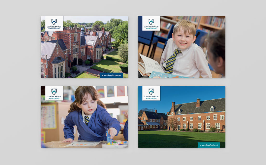
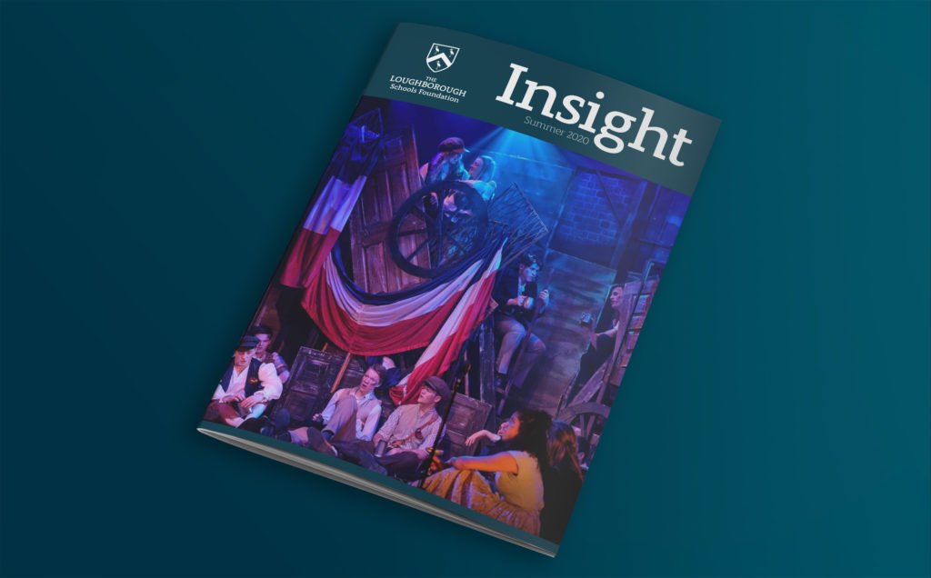
We designed a full suite of promotional materials for the Foundation, including an overhaul of their school prospectuses and accompanying information books.
We wanted to paint a picture of what it’s really like to study at one of the Foundations’ schools, from the perspective of both pupils and parents. We reimagined the books by creating clean, lifestyle-led layouts bursting with engaging imagery to give a strong visual impact and showcase the exceptional facilities, beautiful surroundings, and abundant opportunities available.

The feel of quality
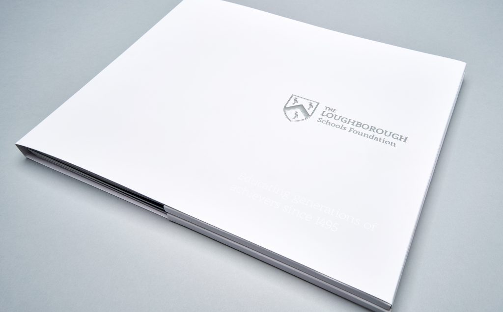
We wanted every aspect of the revised brand to feel special, which is why we specified a high quality, ultra-smooth paper stock for all the printed materials. The premium quality paper, paired with specialist print finishes, underpin the look, feel, and tone of the new brand. You can literally feel the difference – the smooth, tactile texture is soft to touch, and its bright appearance allows the clean layouts and bright colours to really pop.
A picture says a thousand words
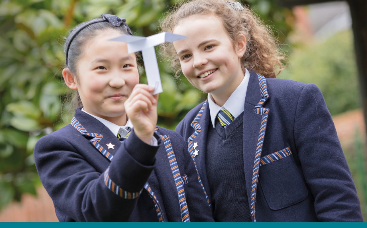
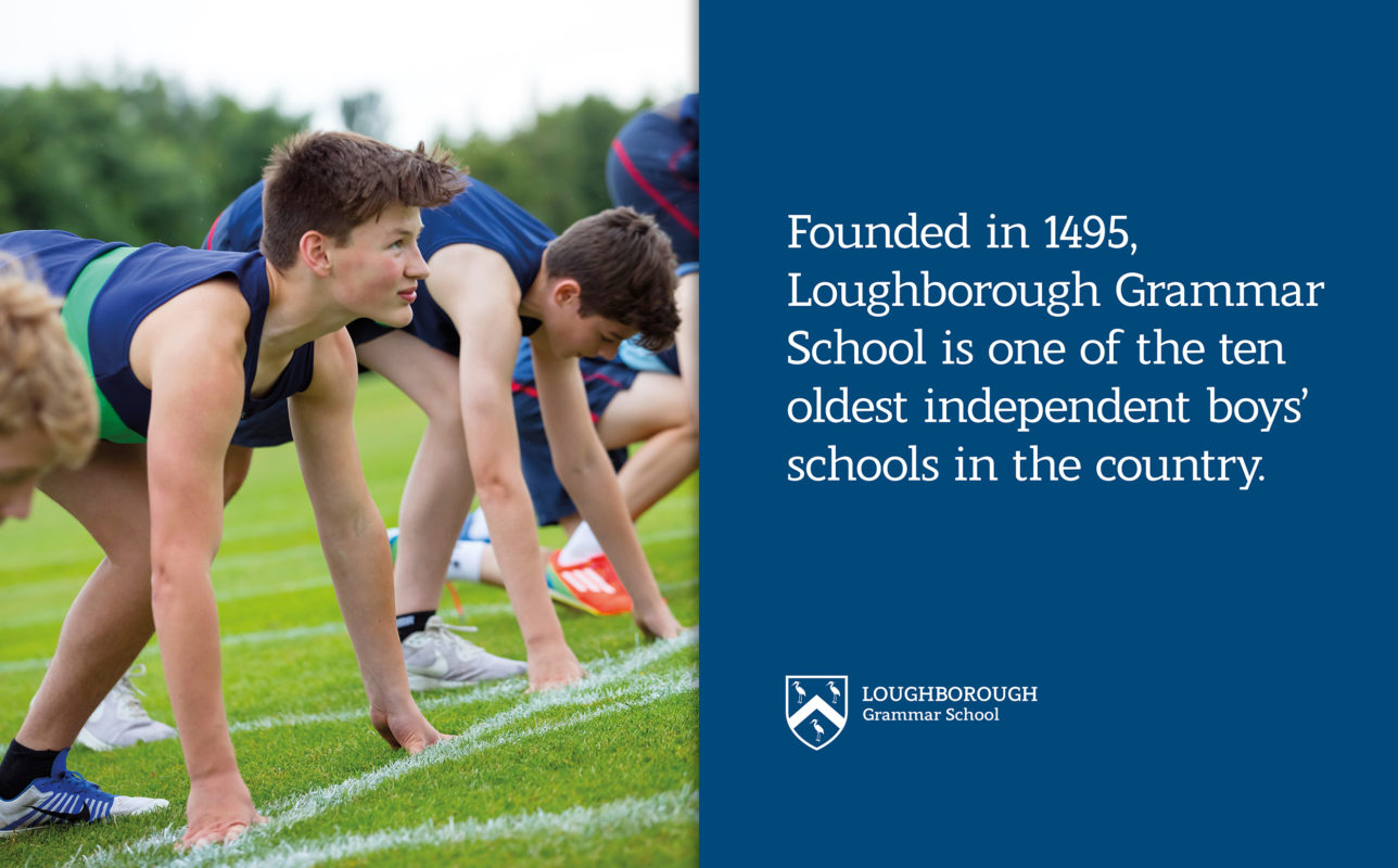
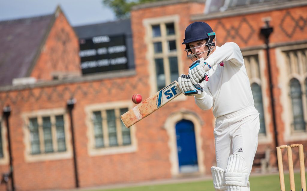
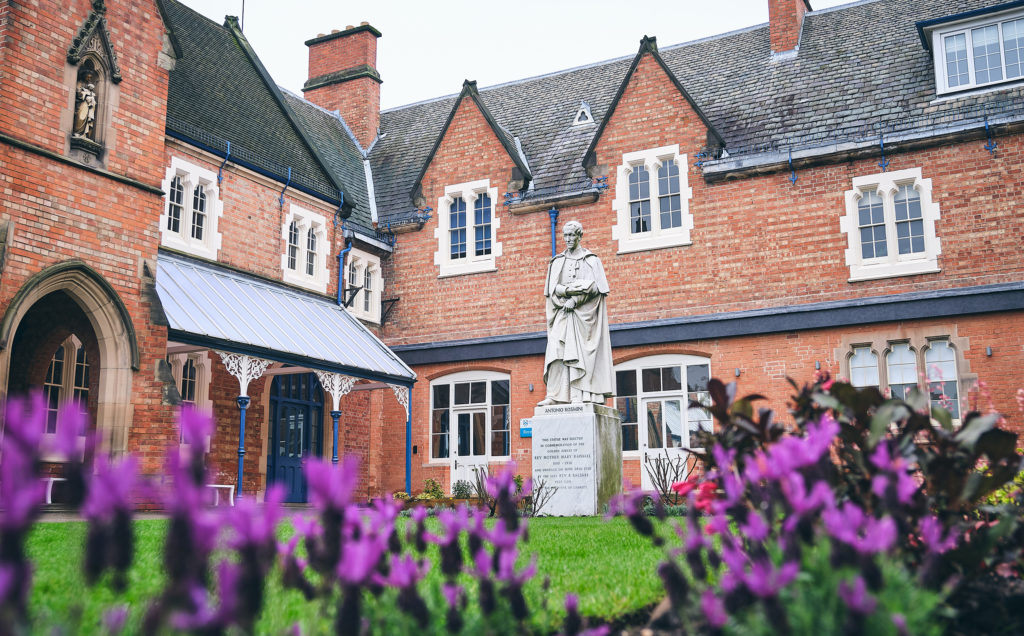
Strong imagery was key part of the brand re-positioning. We organised and art-directed an extensive photo shoot across all the sites of the Foundation. Alongside shooting the stunning school grounds, we captured the essence of what really sets The Loughborough Schools Foundation apart from other groups of schools—its happy, confident, and inspired pupils, learning from the best teaching staff, in the best environment, with the best facilities. Together, as one big family.
Photography: David Baird


With its shallow depth of field, soft focus, and attention to detail, our photography provides a snapshot of what life is like for pupils at The Loughborough Schools Foundation. Capturing academic excellence and creative learning, alongside a wide variety of extra-curricular activities from sports to music, our images deliver a sense of young people’s lives being enriched, and life-long friendships in the making.
Newenglish are a great agency to work with. They have created marketing materials for our family of schools which have helped create distinction in a crowded marketplace... the results speak for themselves. I've worked with other agencies before but none come close to the quality and service I get from Newenglish. Director of Marketing, Admissions and Commercial
You may also be interested in...
Discover the Newenglish Perspective. Why not take a look at our blog?


