Frisk are one of the UK’s leading suppliers of graphic art materials. Whether it be their paints and pastels, their spray mount and markers, or their incredibly wide range of card and specialist paper stock – all Frisk products are manufactured to the highest quality, whilst providing artists with great value for money.
Having been fond of the Frisk brand from our student days, we were delighted when Frisk asked us to help evolve and reposition their brand in the market place, including the redesign of their entire product range packaging.
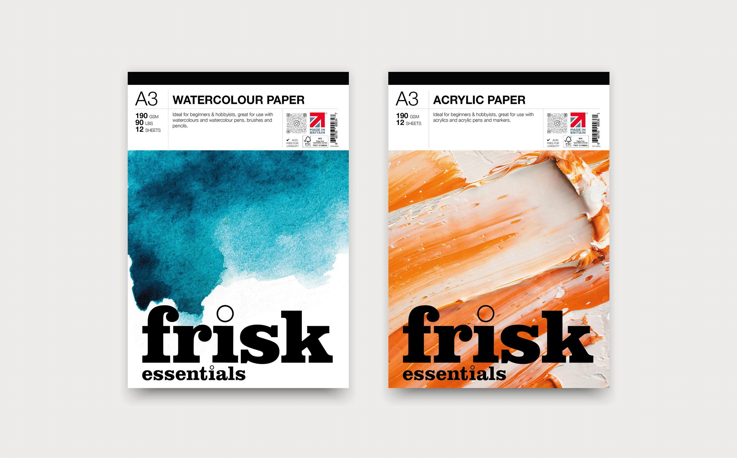
See just some of the work we created for Frisk below. **Our Watercolour Paper pad won BEST STATIONERY OF THE YEAR 2023!
Brand Strategy
Copywriting
Logo Design
Packaging
Print
Brand evolution and re-positioning
As with many well-established brands, the Frisk brand had lost its distinctive brand personality with the passing of time. This can happen when a brand isn’t organically managed and developed by creative professionals.
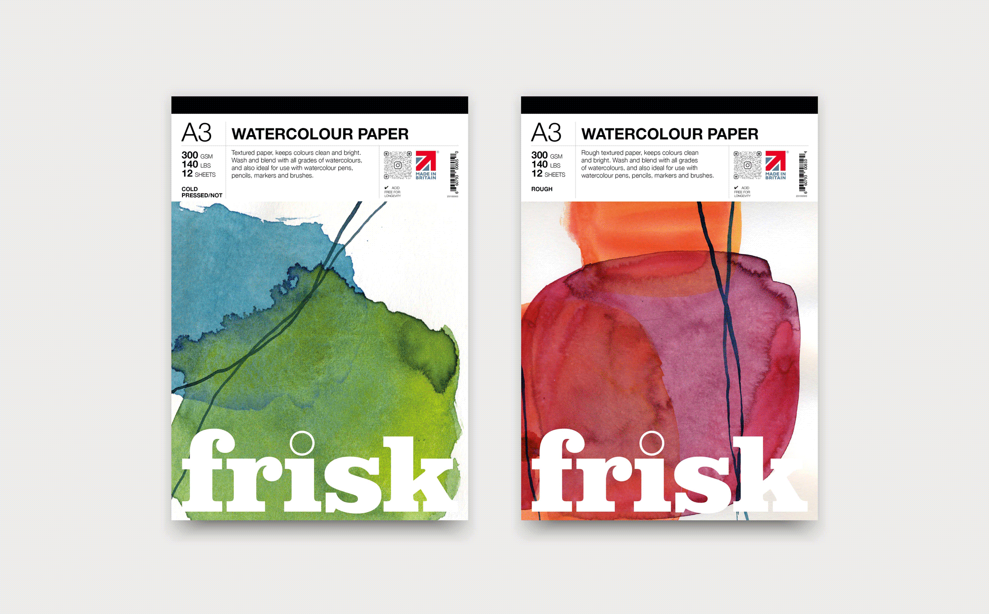
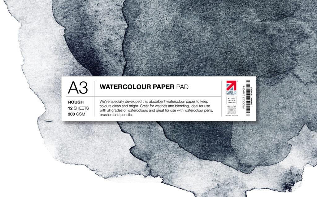
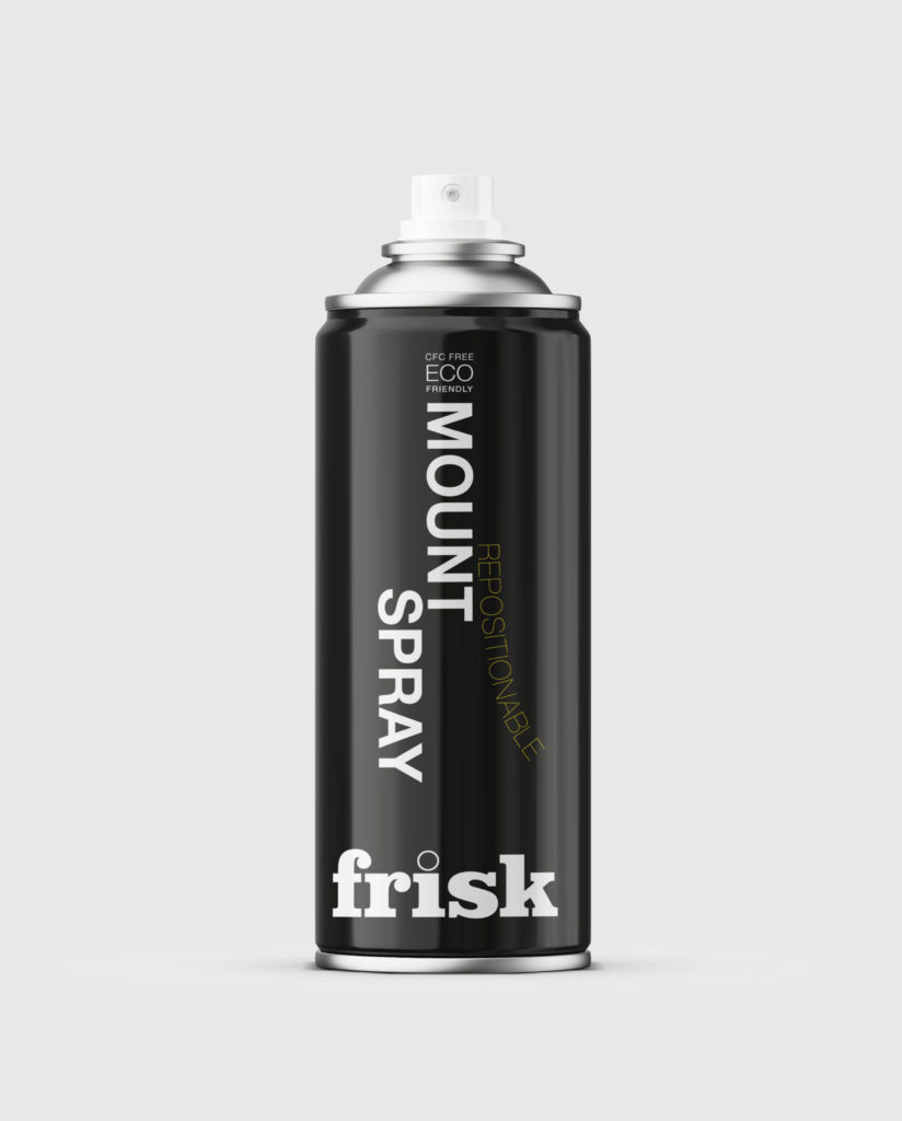
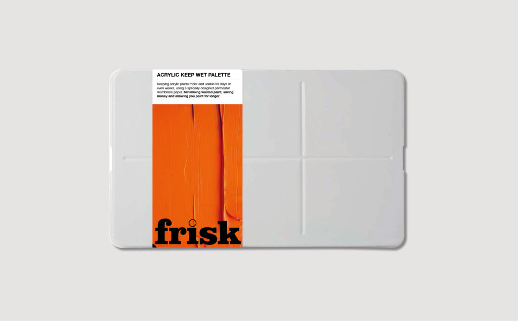
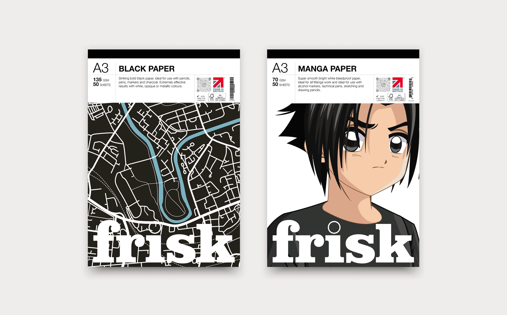
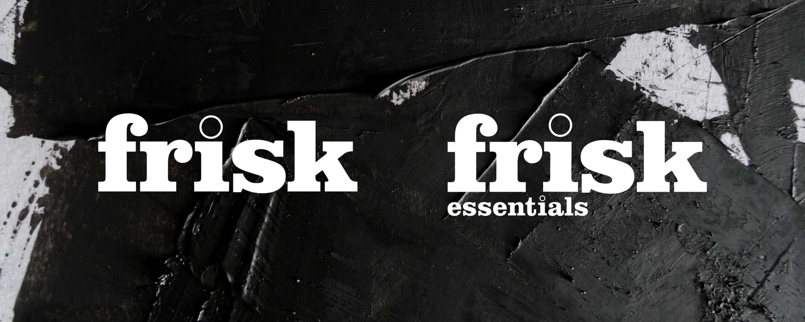
We began by re-drawing the logo design and reversing the forms to strengthen the word FRISK, making the ‘dot’ of the i into an outline so artwork can be seen through that.
It was paramount to hero the brand name and create a design where it was easy to see and compare product information. We also wanted a large space for an abstract creative to reflect how that product might be used to further distinguish products from each other and from competitor’s products; watercolour on watercolour paper, drawings on cartridge paper, inks on specialist ink paper etc. Despite being achieved against a very tight timeline, creating the illustrations and artwork for the packaging was an absolute delight.
Design for online and in-store sales
The information bar along the top of the paper in pads (Frisk’s most extensive ranges) reads easily from a fairly small on-line photograph, with all choice and sales information in one place, within a design inspired by traditional pharmaceutical packaging. The Frisk branding is also prominent when displayed on the shelf in store – always having the same position.
Creating the brand family
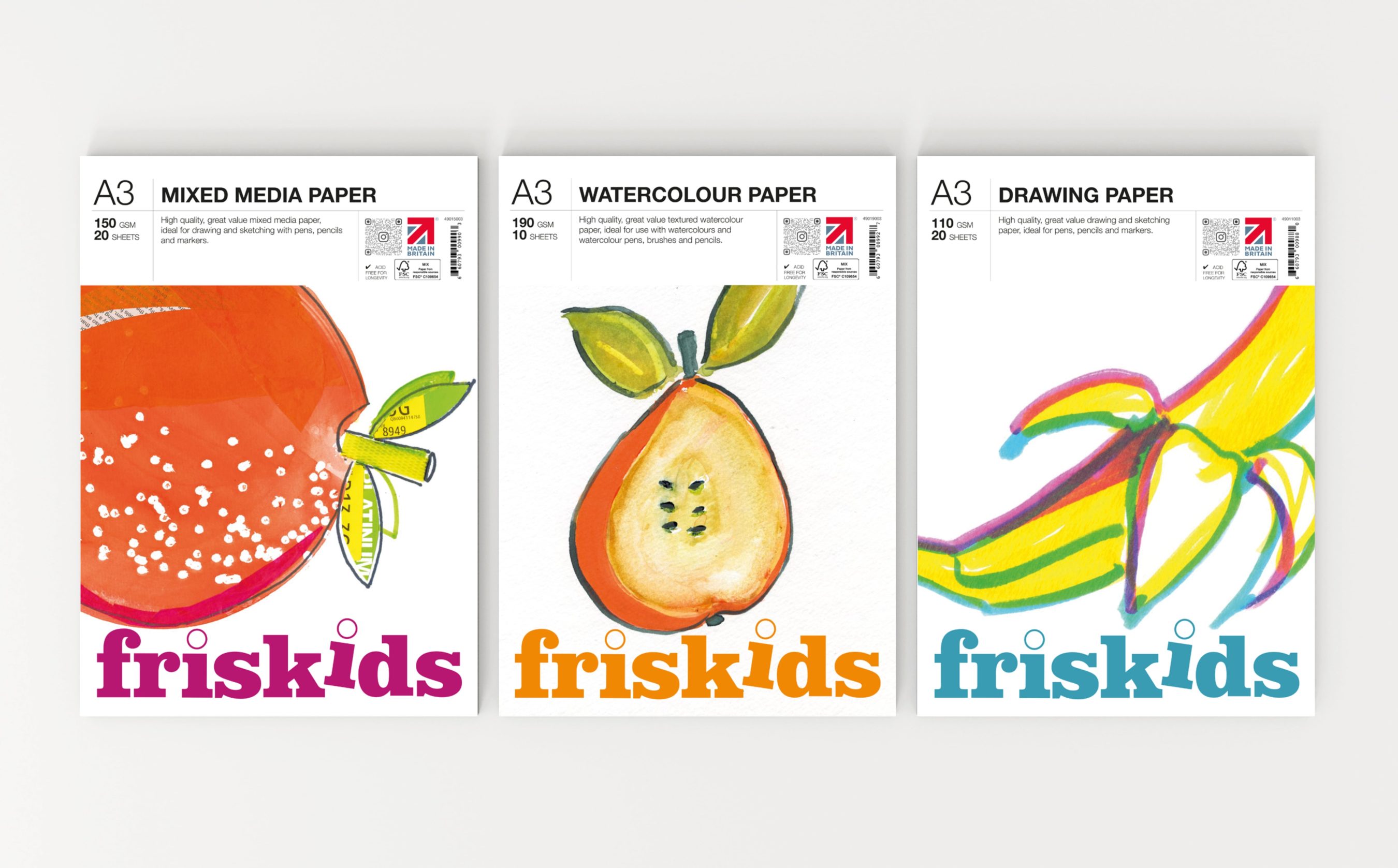
Bringing the budget and children’s product branding into line was a clear opportunity to build strength and recognition across the brand offerings.
The client was delighted with our clean and simple approach to this, and totally loved the children’s range logo which playfully steals the K of Frisk to make the word Kids.
Appealing to budding creatives
Using the design principles established in the main Frisk and Frisk Essentials packaging, we created the FrisKids product lines, adding bold colour with a carefully curated palette and injecting fun with our illustrations.